By 2019, we expect interest rates in the U.S. to rise more than currently anticipated by market participants. We are therefore, overweight U.S. Financials in our balanced and equity growth strategies.
Download this Report
The newest word to join the lexicon of a populace overburdened with information is the “Dot Plot”. For the uninitiated, the dot plot is a graphical representation of the year end interest rate forecast of the 16 voting members of The Federal Open Market Committee (“FOMC”) of the Federal Reserve Bank of the United States (“The Fed” or “Fed”). Under its enhanced transparency initiative, the FOMC provides the dot plot as part of its monetary policy disclosures. Most recent version was released on September 20, 2017.
The publication of the dot plot is greeted with much fanfare, and not only does it move capital markets, but also provides constant fodder for a plethora of journalists, capital market strategists, bloggers, chartists and others fascinated with dots.
We are confident that while penning “Itsy Bitsy Teenie Weenie Yellow Polkadot …”, Paul Vance and Lee Pockriss were oblivious that skimpiness would invade The Fed, laying bare the closet of savers who would be hung out to dry and to sway to the dots, as orchestrated by Janet Yellen, the illustrious custodian of the almighty dot plot.
As investors, our interest in the dots is substantial given that it affects capital allocation, and the portfolio construction decision for our clients. We have been especially intrigued recently after both Citigroup (“Citi”) and J.P. Morgan (“JPM”) disclosed net interest income (“NII”) sensitivity to rising rates. The CEO of Royal Bank of Canada also suggested at an investor conference recently that a 25bps (1/4th of 1 percent) move helps the bank by about $100 million per quarter.
Since any increase in NII driven by rising rates on idle deposits, primarily flows through to the bottom line unimpeded before taxes, to the extent management expectations are conservative compared to those evident on the dot plot, one could argue for continued strength in banks on both side of the North 44. Much of this is not news, but how much of it is already priced into stock prices, is worth investigating further.
Undoubtedly, the mandate of the FOMC is neither the welfare of portfolio managers nor bank managements but attaining full employment and low & stable inflation of 2%. Therefore, it is our assertion that having delivered on the unemployment mandate the Fed must continue the path of normalisation of interest rates, to ensure inflation stays closer to or lower than an annualised 2%.
We are not in the “data dependent” camp – another much abused term making the rounds – and ANTYA believes that the trend for interest rates is onwards and upwards from here.
As illustrated in Figure 1, early hints of wage price inflation are already evident in the October employment report of The Bureau of Labour Statistics.
Figure 1: 3 Month Percent Change – Average Hourly Earnings of All Employees
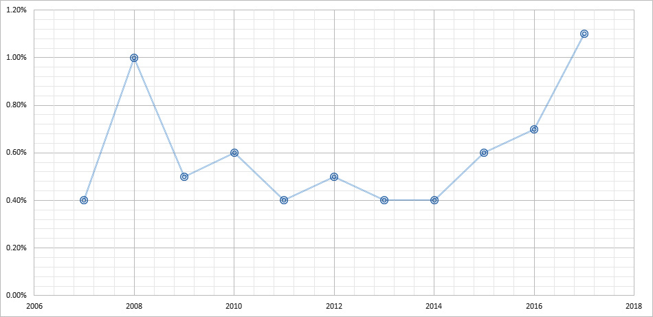
Source: ANTYA, Bureau of Labor Statistics
After bouncing around in a no man’s land for almost a decade, quarterly wage growth has accelerated. For the first time since the 2007-2008 crisis, employment income growth exceeded 1%, both on a sequential and on a y-o-y basis. Retail behemoths Target Corp and Walmart have announced wage increases for all their employees, despite online retailing decimating physical retail operating margins . Many U.S. states are also working on introducing legislation hiking the minimum wage within their jurisdictions with the democrats introducing a federal bill for raising wages to $15/hour. With rebuilding efforts required post hurricane Irma and Harvey in Florida and in Texas during Q4-17, we expect wage pressures to continue in the short term as well.
Annualised wage gain at 2.9% in September 2017 is also the highest since registering 3.4% in 2008. It had been bouncing around the low 2’s in the interim. The change has come about due to unemployment rates approaching historically low-levels as illustrated in Figure 2.
Figure 2: U.S. Unemployment Rate
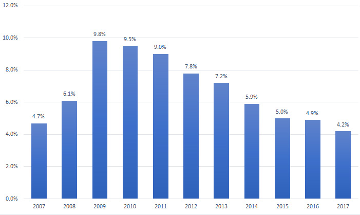
Source: ANTYA, Bureau of Labor Statistics
At 4.2% in September 2017, the unemployment rate is the lowest it has been since 2007. The current low level of joblessness has been attained in the face of a significant slow-down in oil & gas related drilling and exploration activity in both the U.S. onshore and the offshore oil and gas producing areas. Thus, any sustainable increase in the price of oil which will bring about a resurgence in U.S. shale output, would serve as a double whammy and effect labour markets as well as energy markets i.e. increase both wage cost inflation and consumer price inflation, via the inflationary impact of higher commodity price.
Given that backdrop, our medium to longer-term view on steady wage growth and a continued rise in interest rates, intermittently overshadowed by “data dependent” noise, is firmly entrenched.
The Fed thus needs to stay ahead of the game, and in our view, cannot be seen to be playing catch-up; and so, we revert to the dot plot again. Figure 3 highlights the interest rate trajectory that the U.S. economy is headed towards based on parsing the dot plot data.
Figure 3: Expected U.S. Interest Rates Trajectory – per FOMC Forecast
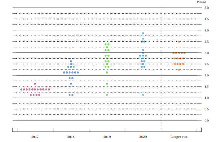
Source: ANTYA and FOMC
As illustrated, the median expectation is for an increase of 70bps between 2017 and 2018, and a further rise of 60bps between 2018 and 2019. Furthermore, the spread between the maximum forecast and the median is 1% in 2020, compared to 0.5% in 2018.
Moreover, while 10 out of 16 members are in the mid to low 2s in 2018, 6 of 16 are at 3% or above in 2020. Some might view that as forecast dispersion in outer years, whereas we view that as forecast pragmatism given the increasingly urgent need to normalise from historically low rates. In recent times, Fed officials have begun referencing elevated asset prices in the same breadth, as the discussion surrounding dual mandate accorded it by Congress.
Therefore, while markets gyrate every day and “data dependency” continues to make its rounds in the media, we firmly believe rates are headed higher in the U.S., with a bias towards a steeper trajectory than currently anticipated by capital market participants. Keeping that in mind we highlight a slide each from JPM and from Citi from their respective investor days showcasing their respective NII sensitivity to rising rates.
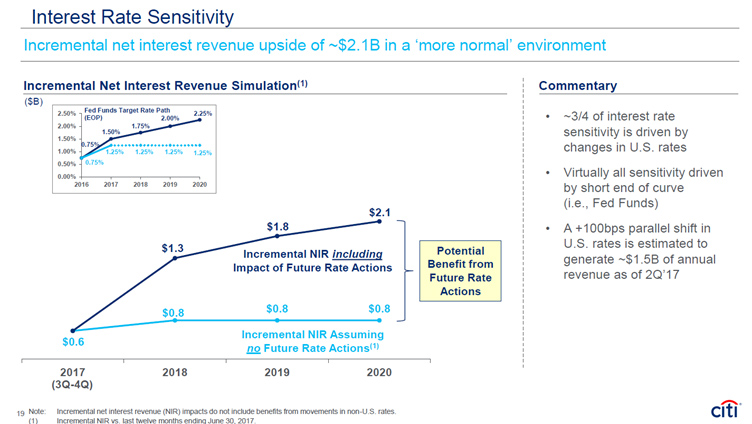
Source: ANTYA and Citigroup
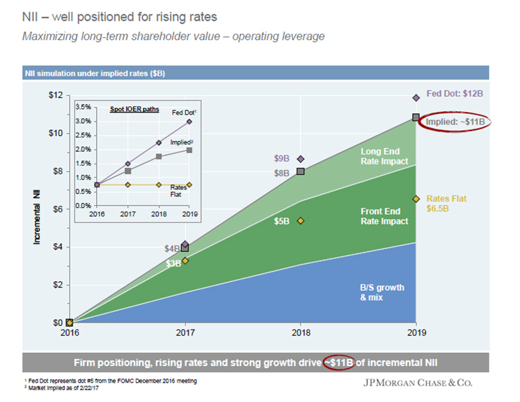
Source: ANTYA and JPMorgan Chase & Co.
From our vantage point, ignoring 2020 for the time being, both in 2018 and in 2019, managements of Citi and JPM are being conservative while discussing the expected benefit to NII when disclosing the impact of higher rates. While both Citi and JPM expect an year end rate of 1.75% in 2018, the median estimate at the Fed is 2.0%. Similarly, in 2019 the Fed median estimate is 2.7% compared to 2.0% at both Citi and JPM. Every basis point is worth hundreds of millions of dollars in incremental NII every quarter to the banking system.
Conclusion
One could argue endlessly that inflation is low and is bound to stay low for myriad reasons, and thus rates are bound to stay low too. Or we could look at historically low unemployment, a growing world economy and arrive at the more likely conclusion that a vigilant Fed will stay its current course.
Forecasts and expectations derived from data are inherently uncertain. Therefore, while we cannot provide a guarantee that the scenario laid out by us will play out as envisioned, we believe that there is a high probability that rates will surprise to the upside.
In ANTYA’s view, to benefit from that upward unexpected bias, a prudent exposure to unloved U.S. financials is warranted, which continue to trade at low price to book and price to earnings multiple, compared to the overall market.
Download this Report
Subscribe
Login
0 Comments